Your new digital delivery checkout: Stage 1 of the radical overhaul is now complete!
more payment options and precise insights into how they can increase their conversion rate. So, we've put our heads together and have come up with something pretty revolutionary in the world of digital delivery. Wohoot! We're delighted (and slightly exhausted) to announce that stage 1 of our radical checkout overhaul is now complete.
more payment options and precise insights into how they can increase their conversion rate. So, we've put our heads together and have come up with something pretty revolutionary in the world of digital delivery. Wohoot! We're delighted (and slightly exhausted) to announce that stage 1 of our radical checkout overhaul is now complete.
Before we move on to what's new we should say there's absolutely no need to move to the new checkout. The old style checkout is still available and you can choose between the two.
Choice of payment options on pay page
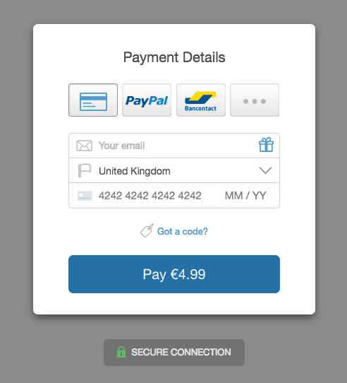
Your customers can now choose which payment method they prefer on the pay page. This keeps your sales funnel as simple and flexible as possible.
Customers can also enter discount codes on the pay page.

Support for the main European payment methods
Customers in European countries such as Belgium, Holland and Germany often don't want to pay using Visa or Mastercard. In fact, many don't have access to them.
Instead they want to use payments methods such as Bancontact in Belgium, Giropay in Germany, iDEAL in Holland and SOFORT in Austria, Belgium, Germany, Italy, Spain.
60% of consumers [in Holland] used iDEAL to pay for their most recent purchase
Bancontact had 27 million online transactions in 2015
SOFORT has processed more than 150 million successful transactions
SendOwl now supports all these payment methods through Stripe. Better still, if your customer is in Belgium, for instance, then our checkout will automatically show the Belgium payment method first, as well as any other payment methods you've enabled.
We're expecting a real up-tick in conversions from customers based in these European countries. We've certainly had plenty of requests from our sellers in these countries so we're excited to see what effect it has.
Added popups for PayPal transactions
PayPal transactions are never going to take the prize for ease of use. However, PayPal remains extremely popular so we're working on making PayPal transactions as easy as possible.
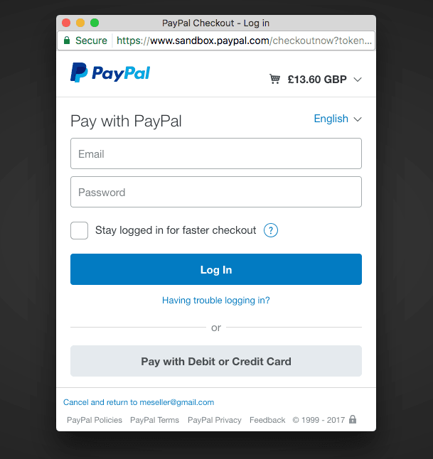
Customers paying with PayPal can now enter their details in a pop up window rather than go through the journey that is a PayPal redirect.

We think this will be a real boost for non-techy buyers who can easily get lost/confused in the PayPal redirect.
Putting card numbers and expiry dates on one line
Okay, this is a tiny change. But it is tiny changes that can increase conversion rates and make you more money. We think that by making your checkout look even easier to fill in (by combining the three credit card fields into one) then fewer people will abandon their cart. The minimum fields required to buy your products is now just an email and credit card numbers, so even the laziest of buyers should get through without giving up.

Address improvements
Previously you could only record one address per order. We've now split that out so shipping and billing addresses are handled separately. This is great for physical good sellers who want to record a billing address as well.
Note: if you're using shipping_ address fields (shipping_address1, shipping_country etc) in any liquid objects (eg emails, web hooks) then you'll need to change those over to billing_ fields (eg billing_address1, billing_country) if the address you request is a billing one. Contact support if you require more information on this.
Mobile enhancements
This is really a large series of small changes, but we're polished our checkout user interface on mobiles to make sure it's as lovely and easy to use as possible.

Improving upsells
Want to offer upsells from a free product? Or sell a free tangible item where only postage is payable? Both these cases are now possible due to the payment method being chosen on the final screen. Great for those who pursue the "give something away free and then upsell" model.
Retina images
We've added retina images so customers on high resolution screens (like modern phones, tablets and some laptops) will see higher quality images. We've even provided these up to 4x the standard resolution so in a few years time when super high resolution screens come on the market, we've already got you covered. We love to think ahead.
Switching to the new checkout
Head to Settings -> Checkout in SendOwl and change the checkout in the Dropdown. The new checkout is available immediately but please be aware if you've made any customisations to the previous checkout then check they're still working on the new version.
What's next?
These checkout highlights should help you boost your conversion rate as they make it even easier for your customers - wherever they are located or however they want to pay – to give you money.
But that's all for now, folks. We'll be in touch in the coming months with plenty more good news.
Our sellers have made over a quarter of a billion dollars through our platform.

Paul Tomes is a highly experienced leader with a special talent for understanding both the product and the customer. Throughout his career, Paul has been a key player in successful startups and has also transformed the product and support experience for organizations with over 100,000 existing customers. His passion for enhancing the user experience has taken it to new heights. By making the product user-friendly and providing timely and relevant information, Paul empowers customers to become the heroes in their own journey.
community


